Rex

Guest booking experience

This guide walks through every guest-facing screen and flow on your reservation page — from landing and browsing packages, to booking, paying, receiving confirmation, modifying, and cancelling — plus the alternative party/event inquiry flow for groups that don't fit instant booking.

The reservation page — venue selection and package browsing

This page covers what guests see when they land on your public reservation page — from venue selection through choosing a package and time slot.

Landing page — Select Location

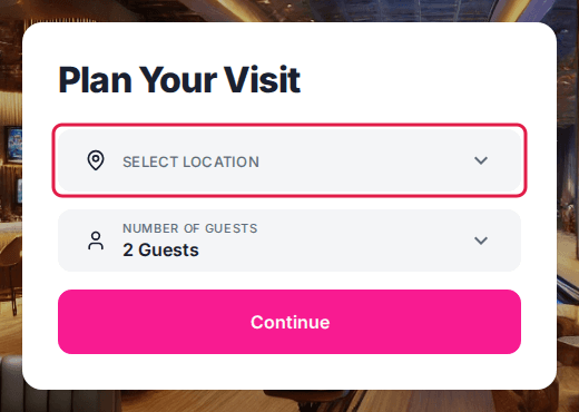
If your account has multiple venues, guests land on `/select-location` first. This screen shows a full-bleed background image (set via Home Background Image in your venue settings) with three input fields stacked vertically:

1. Select Location — dropdown listing all venues. Venues marked "Coming Soon" appear in the list but cannot be selected.

2. Number of Guests — dropdown from 1 to the selected venue's max guest count. If the guest exceeds the maximum, they are redirected to the event inquiry form.

3. Continue — validates a venue is selected, then loads the package browsing page for that venue.

If your account has only one venue, guests skip this screen entirely and land directly on the package page.

### How the title works

The heading displayed above the dropdowns is the Home Title field from your UI settings. It renders in white, bold text over the background image.

Package browsing page

After selecting a venue (or landing directly for single-venue accounts), guests see the main reservation page at `/package`. This page has three sections: a header area, the package list, and a sidebar summary (desktop only).

### Venue header

• Desktop: The venue's Packages Title and Packages Description appear as text at the top.

• Mobile: A large hero image (the venue image) fills the top of the screen. If the venue has a gallery, a View All button appears over the image.

### Tabs

Below the header, horizontal tabs let guests switch between:

FieldDescription
TabLabel
Reservations tabCustomizable — defaults to "Reservations"
Event inquiry tabCustomizable — defaults to "Contact Us"
Custom tabOnly visible if enabled in venue settings

The tab label text is configurable per venue (Packages Tab Name, Event Inquiry Tab Name, Custom Tab Name).

### Date picker

Directly below the tabs, a Select Date field lets guests choose their reservation date. Tapping it opens an inline calendar. Available dates are highlighted based on the venue's availability schedule. Dates with no availability appear grayed out.

### Category filter tabs

If the venue has Package Tags configured, a horizontal row of filter buttons appears above the package cards. Guests tap a category to filter the list (e.g., "Bowling", "Parties", "VIP").

The filter row scrolls horizontally when there are more tags than fit on screen. On desktop, left/right arrows appear at the edges.

### Package cards

Each package renders as a card with an image on the left (or top on mobile) and details on the right:

FieldDescription
ElementDescription
Package imageThe package's configured image, or a default placeholder if none is set. 232×232px on desktop, full-width on mobile.
NameBold title, up to 2 lines before truncating.
PriceDisplayed as "from $XX" with the pricing method underneath (/person, /hour, /lane, etc.). Hidden if **Hide Price** is on for that package.
Discounted priceIf enabled, the original price shows with a strikethrough and the discounted price appears in red. A **Discounted Price Note** badge can appear in the top-right corner.
Short descriptionUp to 2 lines of text below the name.
Guest rangeIcon + "Min–Max Guests" (or a custom Guests Label).
DurationIcon + formatted duration. If **Duration Choice** is enabled, shows the range (e.g., "1–2 Hrs"). Hidden if **Hide Package Duration** is on.
Expand buttonA "+" icon that expands the card to show full details and time slots. Rotates to "×" when expanded.

Contact-only packages show a "Contact Us" button instead of the expand button. The button text is customizable per venue.

Member-only packages show a "Sign In" button if the guest is not signed in with an eligible membership.

### Expanded package view

Tapping the "+" button (or tapping the card) expands it to reveal:

1. Full description — the package's rich-text description rendered as HTML.

2. Reservation Details section (heading is customizable) with form fields:

- Select Date — same calendar picker as the header, scoped to this package.

- Guests — dropdown from the package's min to max guests. Selecting a count above max redirects to the event inquiry form.

- Duration — only visible if Duration Choice is enabled. Shows the configured duration options.

- Resource quantity (e.g., "Lanes") — only visible if Show Resource Quantity is enabled. Label uses the package's resource name.

3. Age group selection — for age-group-based pricing packages, a guest age breakdown selector replaces the standard Guests dropdown. Each age group has its own count picker.

4. Time slots — available start times displayed as a grid of buttons. Each button shows:

- Start time

- Price (unless Hide Price on Time Card is on)

- For age-group packages, "See Prices" with an info icon instead of a flat price

- Reservation end time (if Show Reservation Time is enabled)

5. No availability handling:

- If no times are available for the selected date, an orange alert banner reads: "At the moment, there's no online availability based on your selection."

- If Show Next Available Times is enabled, the system displays time slots from the next dates that do have availability, grouped under date headings like "Wednesday, Mar 28."

6. 21+ age policy checkbox — if the selected time slot has a 21+ restriction, a checkbox appears requiring confirmation before continuing.

7. Continue button — enabled only when a valid date, guest count, and time slot are selected. On mobile, this button is fixed to the bottom of the screen.

### Sidebar summary (desktop only)

On desktop, a right-side panel shows:

### Mobile experience

On mobile:

Loading states

While venue data or package lists are loading, skeleton placeholder cards appear — matching the card layout with gray animated blocks for the image, title, price, description, and action row.

Booking a package — full flow

The package booking page is the main reservation experience guests see when they visit your booking link. It walks them through selecting a package, choosing a time slot, entering their details, and paying.

1

Land on the package page

The page loads at the `/package` route. At the top, guests see your venue name, a hero image (on mobile), and tabs for navigating between **Reservations**, **Contact Us** (event inquiry), and an optional **Custom Tab** if enabled. A date selector sits below the tabs. It defaults to today's date. Tapping it opens a calendar to pick a different day. On desktop, a sidebar shows the venue photo, address, phone number, directions link, menu link, and social media icons. If multiple venues are configured, a **Change** link lets guests switch locations.

2

Browse and select a package

Below the date selector, a **Select a package** heading introduces the list of available packages. Each package card shows: - Package name and image - Short description - Price (with pricing method — per person, per hour, flat rate, etc.) - Guest range (e.g. "2–10 Guests") - Duration or duration range If the venue has package tags configured, a horizontal filter bar appears above the list. Guests tap a tag to narrow the packages shown. An "All" tab shows everything (unless hidden by admin config). Clicking a package card (or the **+** button) expands it to reveal the full booking panel.

3

Configure the reservation

Inside the expanded package card, guests see: - **Full description** — rendered from the package's HTML description field - **Select Date** — a date picker (same date as above, can be changed here too) - **Guests** — a dropdown with the package's min–max guest range. Selecting a guest count beyond the maximum redirects to the Contact Us / event inquiry form. For age-group-based packages, separate quantity selectors appear per age group instead of a single guest dropdown. - **Duration** — only visible if the package has duration choice enabled. Shows a dropdown with the configured duration options. - **Resource Quantity** — only visible if `showResourceQuantity` is enabled. Lets guests choose how many lanes/bays/courts to book.

4

Pick a time slot

After setting the date and guest count, available time slots load below under a **Select Time** heading. Each slot shows: - The start time - The price for that slot (unless the package hides prices on time cards) Guests tap a time slot to select it. The selected slot highlights. If no slots are available for the chosen date, a "no availability" message appears with the venue's configured inactive-package text. If the package has **Show Next Available Times** enabled and the selected date has no availability, the system automatically shows time slots on the nearest future dates under an **Other dates with availability** heading. Some time slots may trigger a **21+ age policy checkbox** — guests must confirm their party meets the age requirement before continuing.

5

Tap Continue

Once a time slot is selected (and any age policy checkbox is checked), the **Continue** button becomes active. Tapping it advances to the next step. The system determines the next step dynamically: 1. **Activities** — if the package supports multi-activity selection, guests pick additional activities first 2. **Add-Ons** — if the venue has add-ons configured, the add-ons selection page loads 3. **Account / Login** — if the guest is not logged in, they create an account or continue as a guest 4. **Reservation Details** — the guest details form (contact info, custom fields, notes) 5. **Payment** — Stripe, Square, or Fortis payment form plus order summary 6. **Confirmation** — booking confirmed with reservation number and email receipt

6

Select add-ons (if available)

The add-ons page shows a grid of available extras — food packages, drink upgrades, shoe rentals, merchandise, etc. Each add-on card displays: - Image, name, short description, and price - A **+** button to add it Tapping the **+** button opens a modal where guests pick quantity, select modifier options (e.g. size, flavor), and add notes. Required add-ons are marked with a red asterisk and must be selected before continuing. If the venue has add-on tags, a filter bar appears at the top to narrow the list. A minimum purchase threshold can block checkout until the subtotal meets the configured amount. On desktop, the **Order Summary** panel appears on the right showing the running total.

7

Enter reservation details

The **Reservation Details** page collects guest information in sections: **Contact Details** — First name, last name, phone number (with country code picker). Birthday field appears if enabled in admin settings. **Guest Details** — Player names, shoe sizes, bumper preferences (for bowling integrations like Steltronic), or other per-guest fields configured on the package. **Additional Info** — Custom questions configured on the package: dropdowns, date pickers, text fields, occasion selector, "how did you hear about us", game type selection, etc. Required fields are marked with a red asterisk. **Notes** — A free-text notes field if enabled by the venue. On desktop, the Order Summary sidebar shows the booking details with an **Edit** button to go back and change selections.

8

Review the order summary and apply discounts

The **Order Summary** appears on the right sidebar (desktop) or as a collapsible section (mobile) throughout the checkout flow. It shows: - Venue name and package name - Date, time, and guest count tags - Line items: base reservation price, each add-on with quantity and modifier details, subtotal - Fees: any custom fees configured by the venue - Discount and coupon amounts (if applied) - Tax (if applicable) - Deposit percentage or amount - Grand Total and **Due Now** amount **Promo Codes and Gift Cards** — A text field lets guests enter a promo code or gift card number. If the venue supports both, tabs toggle between "Promo Code" and "Gift Card." Applied coupons appear as removable chips. Gift cards prompt a PIN entry (if not using GiftUp) and show a confirmation modal with the available balance.

9

Complete payment

The payment page presents the configured payment provider: - **Stripe** — credit card form with saved cards for returning customers - **Square** — embedded Square payment form - **Fortis** — Fortis hosted payment fields Venue policies and waiver text appear above the payment button. The **Due Now** amount is displayed prominently. If the deposit calculates to zero (e.g. full gift card coverage or free package), the payment step is skipped entirely and the reservation is confirmed immediately. For reservations being modified, the system calculates the price difference and shows the adjusted amount due.

10

See the confirmation

After successful payment, the **Reservation Confirmed** page shows: - A confirmation icon - "Reservation Confirmed" heading - Reservation number (e.g. #12345) - A note about checking email (including spam folder) - The email address the confirmation was sent to - A **Go Back to Homepage** button (or **Invite Guests** if the package supports guest invitations) On desktop, the full Order Summary appears alongside the confirmation.

The booking flow's per-step routes

After selecting a package and time slot, guests move through a multi-step booking flow at `/reservation-info`. A progress indicator (desktop only) shows where they are. Each step is a separate route under `/reservation-info/`.

Steps in the booking flow

1

Account (`/reservation-info/account`)

The guest signs in, creates an account, or continues as a guest.

• Guest checkout — enter email only (unless disabled by the venue). This is the default if `defaultToGuestCheckout` is enabled.

• Create account — full registration with email, password, first name, last name, and phone.

• Sign in — email and password. A "Forgot password" recovery flow is available.

• Phone login — sign in via phone number (modal).

Guest checkout can be disabled per venue. The "Create account" option can also be hidden.

2

Activities (`/reservation-info/activities`)

Appears only when the package has linked activities. Guests select from available activity options.

• Activity cards show name, image, description, and available time slots.

• Required activities are marked with a red asterisk. The guest cannot proceed without selecting all required activities.

• Duration and lane count selectors appear when the activity allows guest choice.

• An order summary sidebar (desktop) updates in real time.

3

Add-ons (`/reservation-info/addons`)

Appears when the venue has add-ons configured. Guests browse and add extras to their reservation.

• Add-ons display in a grid with image, name, price, and description.

4

Reservation details (`/reservation-info/reservation-confirm`)

The guest fills in contact and booking information.

Contact Details (always shown):

Guest Details (shown per package configuration):

Additional Info (shown per package configuration):

Notes — a free-text area if the venue enables custom notes. Can be required and pre-filled with default text.

On desktop, an order summary sidebar shows the booking details, price, and an edit button.

5

Waiver (`/reservation-info/waiver`)

Appears when the selected package has a waiver template. The guest signs a DocuSeal waiver form inline. Declining sends the guest back to package selection.

6

Profile photo (`/reservation-info/collect-profile-photo`)

Appears when profile photo collection is enabled. The guest can upload a photo or skip.

7

Payment (`/reservation-info/payment`)

The guest pays the deposit or full amount. The payment provider depends on venue configuration:

If the deposit is $0 (fully covered by gift cards or coupon codes), the guest sees a "Complete Reservation" button with no payment form. Venue policies display as a checkbox the guest must accept (if enabled). Gift card and coupon code inputs appear if enabled for the venue.

8

Confirmation (`/reservation-info/confirmed`)

After payment, the guest sees:

Checkout field reference

The Reservation Details screen collects guest information before payment. Fields are grouped into sections. Some sections only appear when enabled in your venue or package settings.

Fields

Contact Details (always shown)

FieldDescription
First NameGuest's first name. Pre-filled if the guest is signed in.
Last NameGuest's last name. Pre-filled if the guest is signed in.
Phone NumberUsed for reservation communications. Must be a valid phone number.
BirthdayShown only if enabled in venue profile settings. Can be set as required. Format: MM/DD/YYYY.

Guest Checkout (email capture — shown when not signed in)

FieldDescription
Email AddressUsed to send the confirmation email.
Confirm Email AddressMust match the email field exactly.
Keep me updated (checkbox)Marketing opt-in. Checked by default unless the venue has disabled this.

Guest Details (shown when package has guest-level custom fields enabled)

FieldDescription
Player Name (per guest)One name field per guest. Used for Steltronic lane assignments or similar per-guest integrations.
Shoe Size (per guest)Appears alongside player name for Steltronic bowling integrations.
Add Bumper (checkbox, per guest)Bumper bowling option per player. Shown for Steltronic integrations.
Guest [N] Full NameFull name for each guest in the party. Enabled via the Guest Names custom field.

Additional Info (shown when package or venue has custom questions or fields enabled)

FieldDescription
OccasionDropdown. Options are configured by the venue (e.g., Birthday, Anniversary, Corporate).
Group NameText field for the group or party name.
Guest of Honor NameText field for the name of the person being celebrated.
Guest of Honor BirthdateDate field. Format set by venue (default: MM/DD/YYYY).
How Did You Hear About UsDropdown. Options are set by the venue.
Game SelectionDropdown. Used for venues with multiple game types.
Dining SelectionDropdown. Used for venues with food and beverage packages.
Custom QuestionsAny additional questions created by the venue in package settings. Can be text, dropdown, date, or email format.

Address (shown when the Address custom field is enabled)

FieldDescription
AddressFree-text address field.

Notes (shown when Custom Notes is enabled on the venue)

FieldDescription
NotesFree-text area for special requests or instructions. The label and placeholder text are configurable per venue.

Notes

- Fields marked Configurable are only shown when enabled in your venue or package configuration in the admin dashboard.

- Mandatory custom fields are enforced on submit — the guest cannot proceed without filling them in.

- For Steltronic integrations, the number of player detail entries always matches the guest count selected during package selection.

Party or event inquiry (non-instant booking)

The party/event inquiry page lets guests request a booking for group events like birthday parties, corporate outings, or private gatherings. This is not an instant booking — it submits a request that the venue reviews and follows up on.

The page uses a tabbed layout. The Contact Us tab (or whatever the venue has named it) is selected by default when guests land on the `/party` route. The other tabs link to standard reservation packages and an optional custom tab.

1

Select a location and occasion

The form starts with two dropdowns side by side.

Pick a venue from the Location dropdown. Only open venues appear (no "Coming Soon" locations). Select the event type from the What's the Occasion? dropdown — options are configured by the venue (e.g., Birthday, Corporate Event, Holiday Party).

2

Choose a date

Click the Select Date field to open an inline calendar.

Pick the event date. The calendar shows availability based on the selected venue. After selecting a date, the calendar closes and the field updates.

3

Set the start time and duration

Two dropdowns appear side by side: Event Start Time and Event Duration.

Start times are generated in 30-minute intervals based on the venue's operating hours for the selected date. Duration options are preset (e.g., 1 hour, 1.5 hours, 2 hours, etc.).

4

Enter the number of guests

Type the estimated guest count into the Number of Guests field.

The venue may enforce a minimum or maximum. If the count is outside the allowed range, an error message appears (e.g., "Guest number should be less than 50").

5

Click Next to continue

The Next button is disabled until all fields in this step are filled. Click it to advance to the contact information phase.

6

Enter contact details

The form switches to show four fields: First Name, Last Name, Email, and Phone.

All four are required. Email and phone are validated — an invalid format triggers an inline error. A checkbox labeled "Keep me updated on exclusive offers and events" (or custom text set by the venue) is pre-checked by default unless the venue has configured it otherwise.

If the venue has added a note (e.g., deposit policy or cancellation terms), it appears below the checkbox.

7

Submit the inquiry

Click Next again to submit the request.

The form sends all event details plus contact information to the venue. Google Analytics tracking parameters (UTM source, medium, campaign, etc.) are captured automatically if present. On success, the guest is redirected to the confirmation page.

FieldDescription
LocationThe venue where the event will take place. Only open locations are listed.
What's the Occasion?The event type — configured by the venue in admin settings.
Select DateThe requested event date. Opens an inline calendar.
Event Start TimeAvailable start times in 30-minute intervals based on venue hours.
Event DurationHow long the event will last. Options are preset in 30-minute increments.
Number of GuestsEstimated headcount. Must be a number within the venue's allowed range.
First NameGuest's first name. Required.
Last NameGuest's last name. Required.
EmailGuest's email address. Required and validated.
PhoneGuest's phone number. Required and validated.
Keep me updatedOpt-in checkbox for promotional emails. Pre-checked by default unless the venue disables it.

What guests see after submitting an event inquiry

After a guest submits an event inquiry through the party booking form, they land on the confirmation page (`/thank-you`). This page confirms the request was received and displays a summary of the submitted details.

What guests see

The page shows a centered confirmation card with the following elements, top to bottom:

1. Thank-you icon — a decorative graphic at the top of the card.

2. "Request submitted" label and "Thank You" heading.

3. Confirmation title — defaults to "Thank you for inquiring about a party!" but can be customized per venue via the `eventConfirmationPageTitle` setting.

4. Confirmation copy — if the venue has set custom copy (`eventConfirmationPageCopy`), it renders here as rich HTML. Otherwise, the default message reads: *"We've received your event request and will reach out shortly to plan your next event."*

5. Guest's email address — displayed in bold so the guest knows where to expect a follow-up.

6. Venue name — shown as a clickable link to the venue's location URL (e.g., Google Maps or the venue's website).

7. Event summary — five detail lines:

- Occasion (e.g., Birthday, Corporate Event)

- Event Date (formatted as a readable date)

- Event Start Time (in 12-hour or 24-hour format based on venue settings)

- Event Duration (e.g., "2 hours")

- Number of Guests

8. "Go Back to Homepage" button — links to the venue's configured homepage URL.

On desktop, the right sidebar shows venue details (name, address, contact info). On mobile, the layout is single-column with no sidebar.

The confirmation email

Every completed booking triggers an automatic confirmation email to the guest's email address.

What the confirmation email includes

• Venue name and address
• Package name and description
• Date and time of the reservation
• Number of guests
• Resources assigned (lanes, bays)
• Total charged and payment breakdown
• Add-ons ordered
• Cancellation policy
• Manage Reservation link (to modify or cancel)
• Add to Calendar button (if enabled)
• Waiver signing link (if required)

Enable add-to-calendar buttons on the confirmation email

Enable the add-to-calendar button on confirmation emails so guests can save their reservation to their personal calendar.

1

Navigate to your venue's general settings

Open your venue in the admin dashboard and go to the General tab.

VenuesYour VenueGeneral
2

Toggle on Enable Add to Calendar

Find the Enable Add to Calendar toggle and turn it on.

3

Save and verify

Save your changes. Confirmation emails will now include add-to-calendar buttons, making it easy for guests to save the reservation to their personal calendar.

Paying an outstanding balance on an existing reservation

Guests who owe an additional balance on a reservation receive a payment link. The /pay-reservation page loads the reservation and presents the venue's payment form.

1

Open the payment link

The guest opens a URL like `/pay-reservation?id=<reservation-id>&token=<auth-token>`. Both parameters are required — if either is missing, the page shows: "Content load error, URL is not valid."

2

Review and pay

The reservation loads in the background. The guest sees the standard payment form — the same one used during initial booking. The venue's configured payment provider (Stripe, Square, Heartland, Fortis, GoTab, or Sezzle) determines which form appears. The guest enters payment details and submits.

3

See confirmation

After successful payment, the page transitions to the confirmation screen showing: - "Reservation Confirmed" with the reservation number - Confirmation email notice - On desktop: an order summary sidebar with booking details

How guests modify a reservation

Guests can modify their own reservations through the confirmation email link, as long as your venue allows self-service modifications.

1

Open the confirmation email

The guest opens their booking confirmation email.

2

Click Manage Reservation

The guest clicks the Manage Reservation or View Booking link.

3

Click Modify

On the reservation page, the guest clicks Modify Reservation.

4

Select a new time or date

The guest picks a new available date and time.

5

Confirm changes

The guest confirms and receives an updated confirmation email.

How guests cancel a reservation

Guests can cancel their own reservations through the confirmation email link, subject to your cancellation policy.

1

Open the confirmation email

The guest opens their booking confirmation email.

2

Click Manage Reservation

The guest clicks the Manage Reservation link.

3

Click Cancel

The guest clicks Cancel Reservation.

4

Confirm cancellation

The guest confirms. If within the refund window, they receive a full or partial refund per your policy.

Updated May 30, 2026

Was this helpful?